Withings • 2023 • Lead Product Designer
Withings • 2023 • Lead Product Designer
The Measure Tab
The Measure Tab
Overview
Overview
Overview
Context
Context
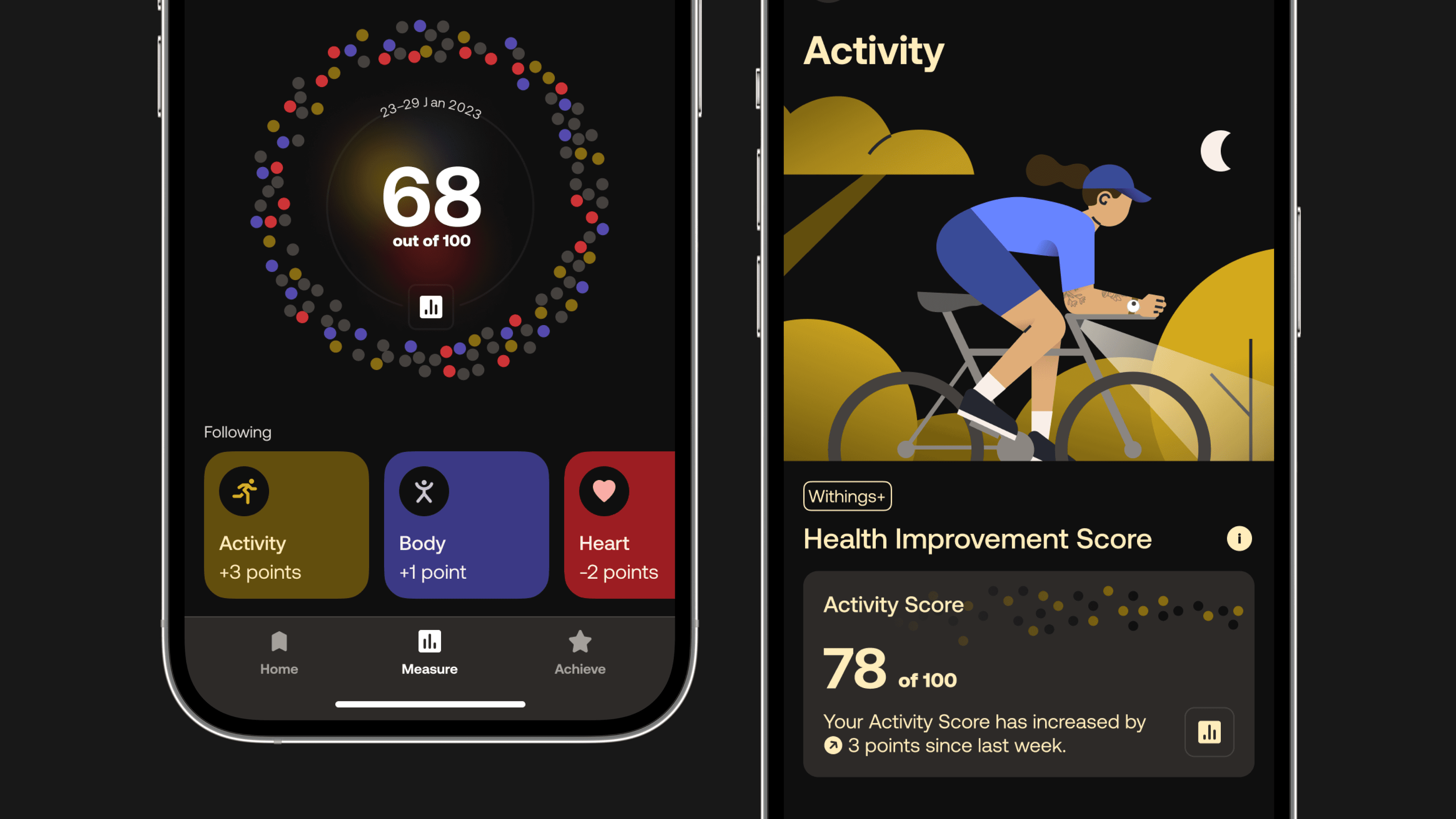
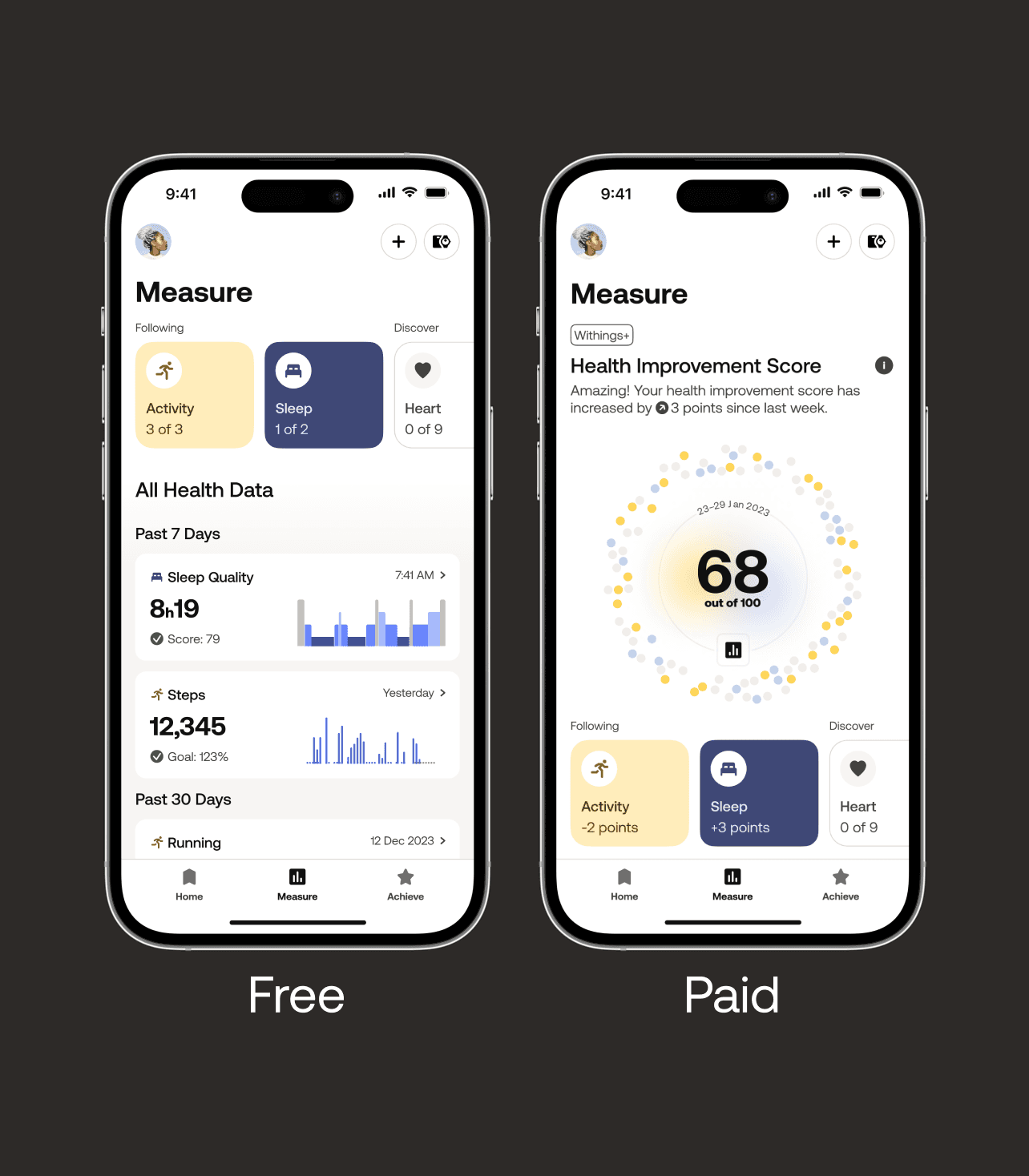
The all-new "Measure" tab, dedicated to showcasing and communicating health data. At the top of the tab is the Health Improvement Score, providing users with a personalized visual representation of how their actions and measurements contribute to their overall health, as well as new ways to navigate and explore data.
I led the end-to-end design and research (sole contributor) of this experience alongside Product Manager Léonard Devincre (App).


Problem
Problem
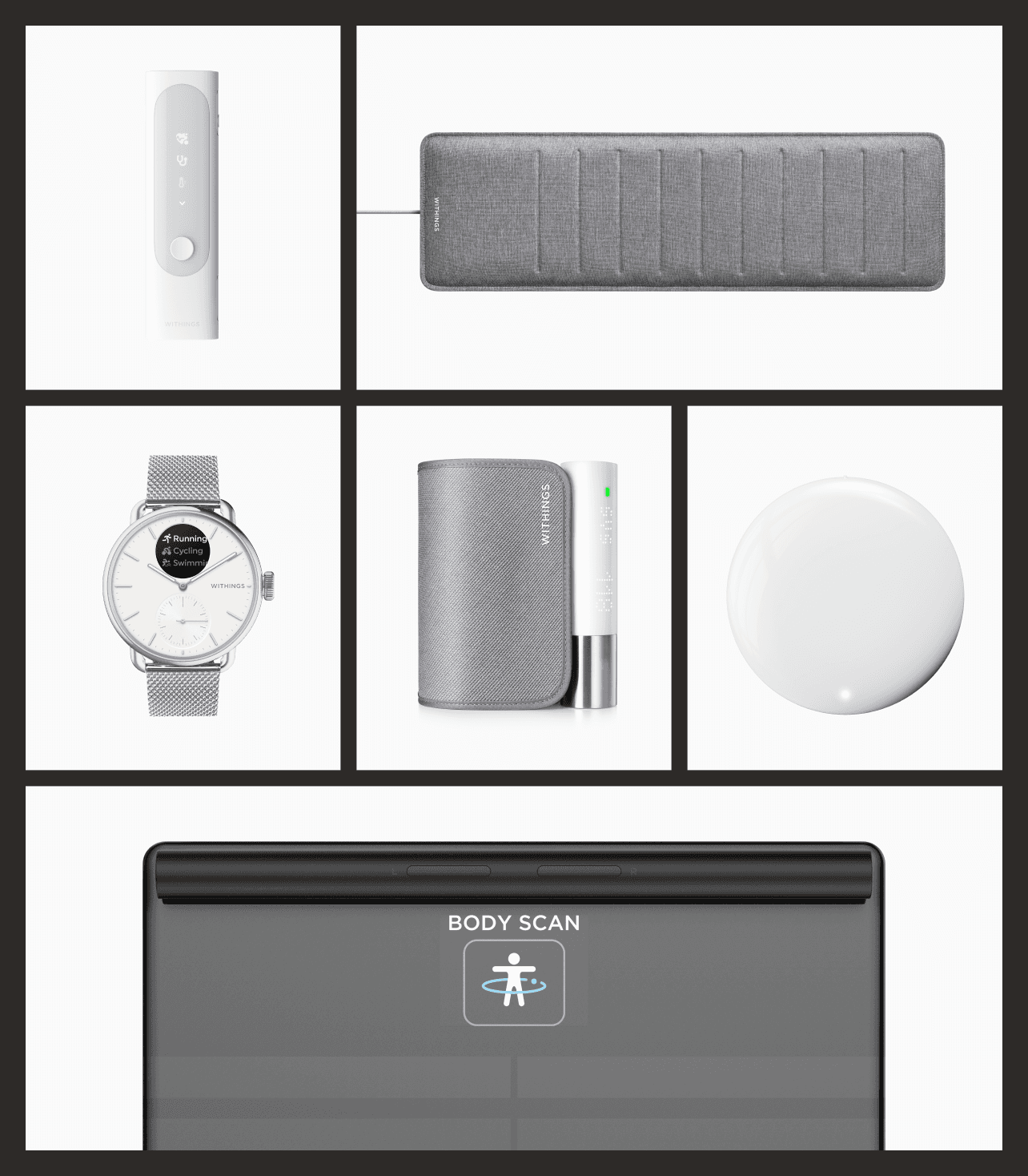
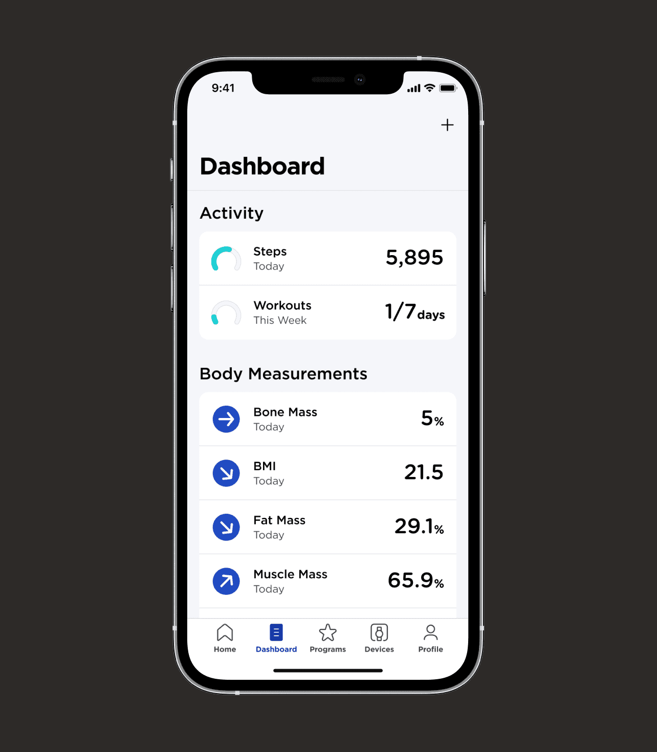
In 2022 we launched our subscription service that was focused on workouts, recipes, and articles, but users expressed dissatisfaction with the absence of a meaningful connection to their Withings devices. Furthermore, the core focus of the company, centered around providing innovative health monitoring devices, presented a challenge as users struggled to comprehend how various biomarkers collectively reflected their overall health. Lastly, user feedback highlighted that the app was cold, linear and clinical, giving us an opportunity to inject warmth. Addressing these issues is crucial to ensure we offer a compelling subscription service that onboards and retains users.
In 2022 we launched our subscription service that was focused on workouts, recipes, and articles, but users expressed dissatisfaction with the absence of a meaningful connection to their Withings devices. Furthermore, the core focus of the company, centered around providing innovative health monitoring devices, presented a challenge as users struggled to comprehend how various biomarkers collectively reflected their overall health. Lastly, user feedback highlighted that the app was cold, linear and clinical, giving us an opportunity to inject warmth. Addressing these issues is crucial to ensure we offer a compelling subscription service that onboards and retains users.




Results & Impact
Results & Impact
80%
80%
80%
of Withings+ conversions come from the Health Improvement Score. 60% more than initially planned.
of Withings+ conversions come from the Health Improvement Score. 60% more than initially planned.
Nº1
Nº1
Nº1
factor for user retention in the Withings+ subscription service.
factor for user retention in the Withings+ subscription service.
30%
30%
30%
increase in visits to the new “Measure” tab compared to it’s “Dashboard” predecessor.
increase in visits to the new “Measure” tab compared to it’s “Dashboard” predecessor.
1
1
1
protected design filing awarded to Withings for the Health Improvement Score visual with myself listed as the inventor.
protected design filing awarded to Withings for the Health Improvement Score visual with myself listed as the inventor.
Tab Structure
Tab Structure
Tab Structure
New Ways to Explore
New Ways to Explore
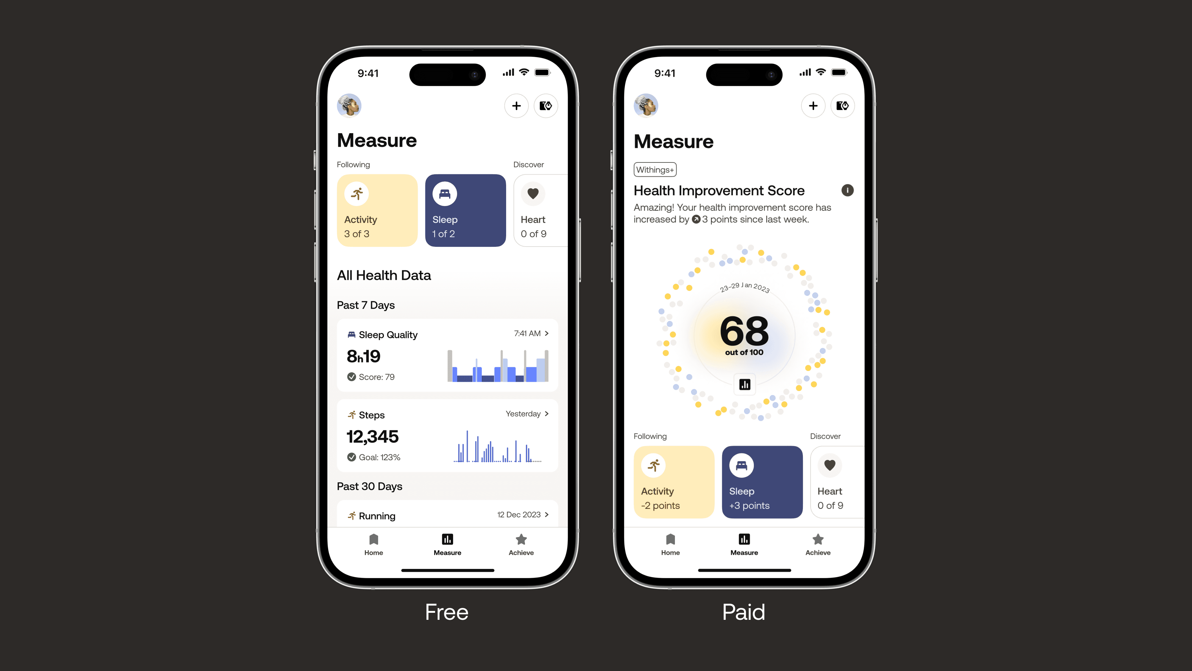
The structure is simple. For Withings+ users they will gain a unique visual piece at the top called the "Health Improvement Score" providing them a snapshot of their global health. There's now also health category navigation that communicates the number of tracked metrics for free users, and score changes for paid users. Users can also explore "All Health Data" based on chronological groupings, reminding them of the metrics or devices they haven't engaged with for a while.
The structure is simple. For Withings+ users they will gain a unique visual piece at the top called the "Health Improvement Score" providing them a snapshot of their global health. There's now also health category navigation that communicates the number of tracked metrics for free users, and score changes for paid users. Users can also explore "All Health Data" based on chronological groupings, reminding them of the metrics or devices they haven't engaged with for a while.

Health Improvement Score
Health Improvement Score
Health Improvement Score
The Score
The Score
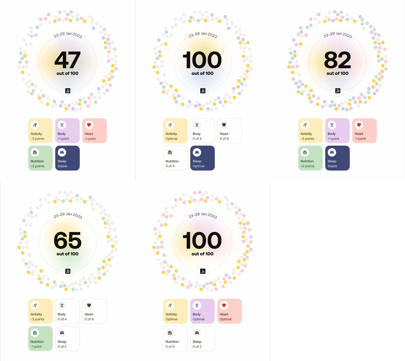
With the score we aimed to enhance the value proposition for Withings+ and attract more subscribers by incorporating a feature that combines measurements so that users can make sense of how they contribute to the big picture. This culminates in the Health Improvement Score, a fully personalized visualization that captures the individual biology of each user. Irrespective of whether the score is high or low, the visualization maintains its allure and warmth, providing users with a secure space to track their health progress and inspiring them to embrace positive changes in the long run.
With the score we aimed to enhance the value proposition for Withings+ and attract more subscribers by incorporating a feature that combines measurements so that users can make sense of how they contribute to the big picture. This culminates in the Health Improvement Score, a fully personalized visualization that captures the individual biology of each user. Irrespective of whether the score is high or low, the visualization maintains its allure and warmth, providing users with a secure space to track their health progress and inspiring them to embrace positive changes in the long run.


Exploration
Exploration
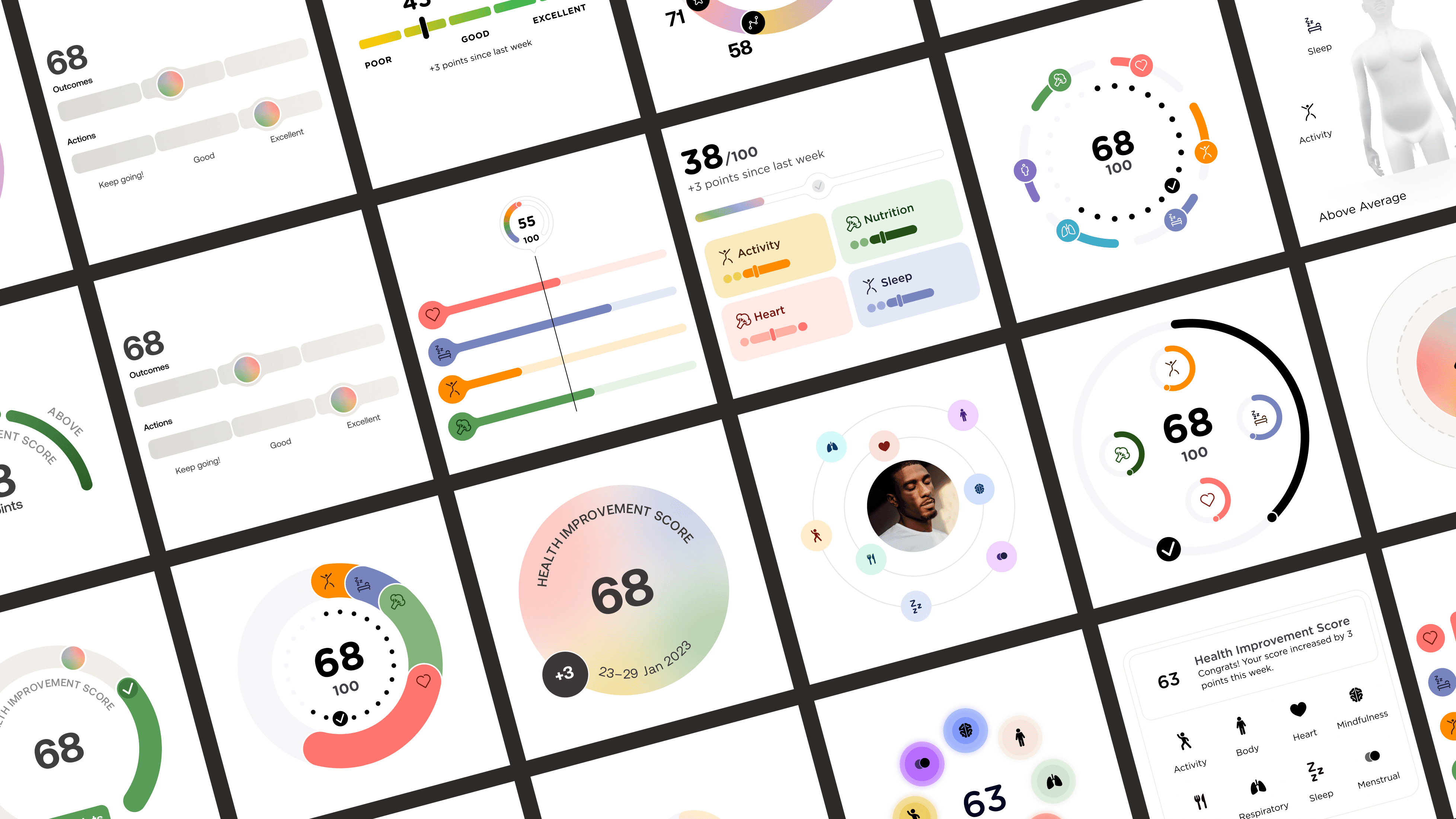
The iterations explored various ideas such as rings, gauges, integration of health categories, distinctions between outcomes and actions, and considerations of whether the score should have a defined ceiling or be limitless.
The iterations explored various ideas such as rings, gauges, integration of health categories, distinctions between outcomes and actions, and considerations of whether the score should have a defined ceiling or be limitless.


The Sub Scores
The Sub Scores
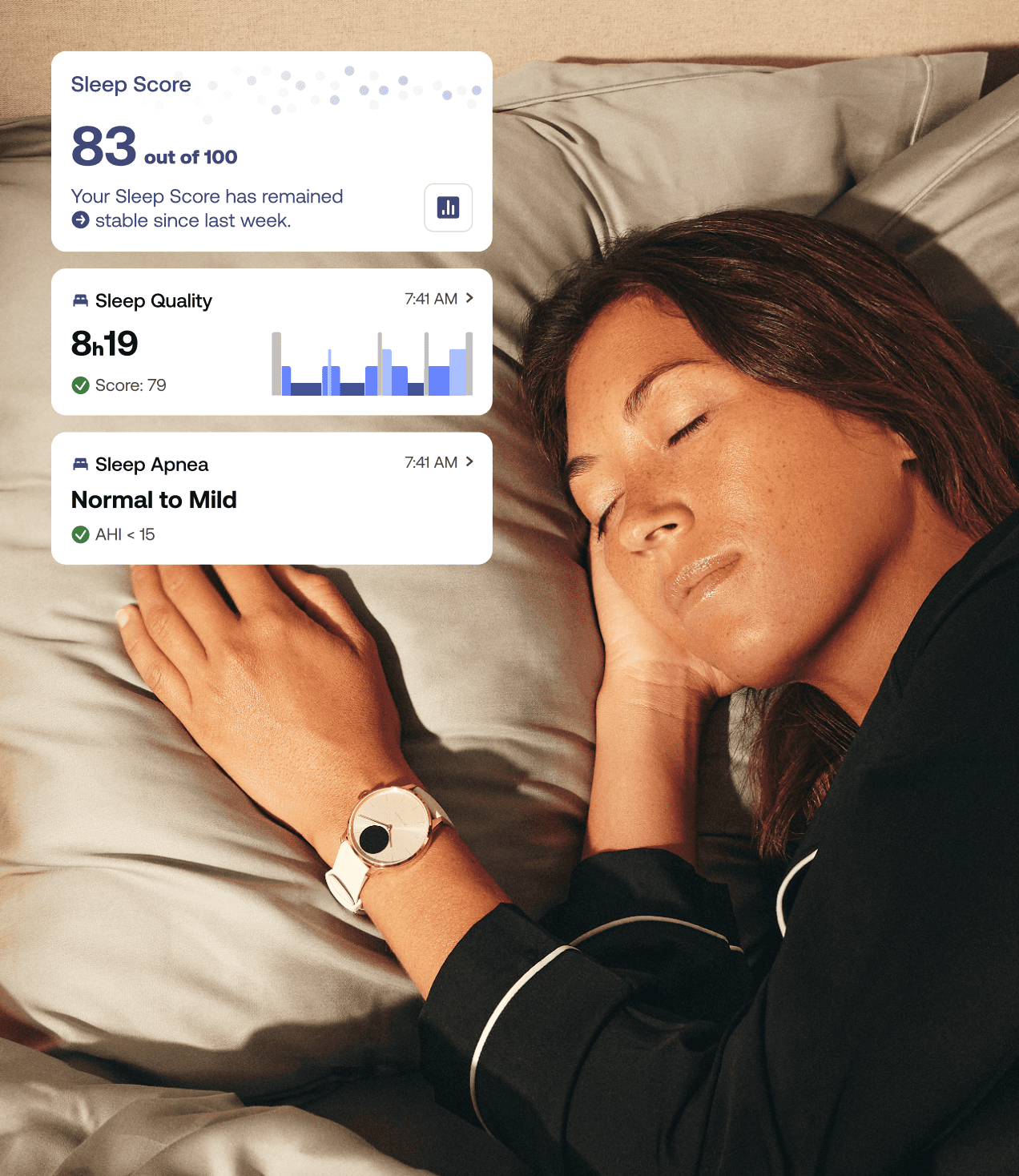
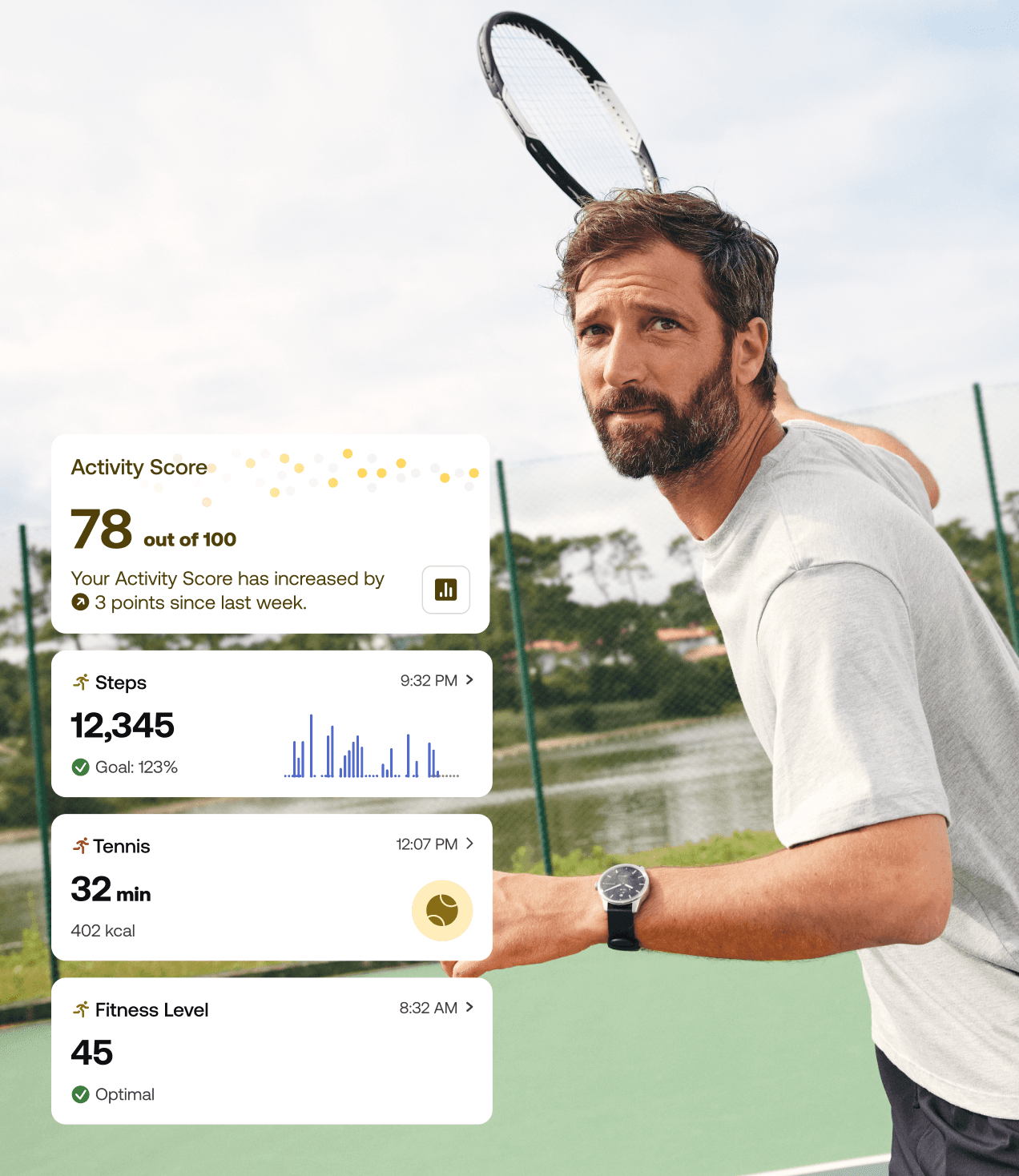
The Health Improvement Score is formed of several sub scores that span each health category that our devices support, such as "Sleep" or "Activity". This provides users with a way to know what areas of their health needs the most attention to have the greatest impact on their global score.
The Health Improvement Score is formed of several sub scores that span each health category that our devices support, such as "Sleep" or "Activity". This provides users with a way to know what areas of their health needs the most attention to have the greatest impact on their global score.




Health Categories
Health Categories
Health Categories
An Identity Per Category
An Identity Per Category
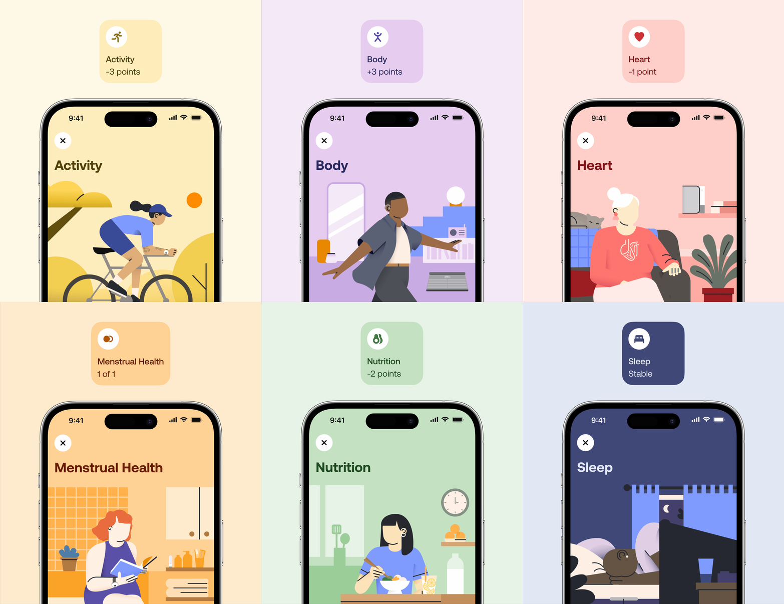
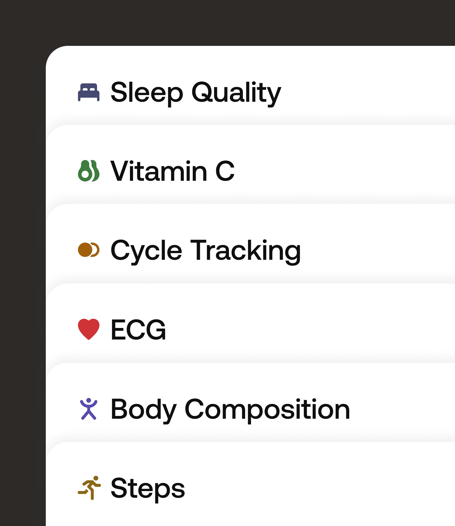
By using iconography, colour and illustration we reimagined the categorical organization in order to create clarity regarding the specific area of health to which the measurements relate. This has allowed us to depart from a cold and clinical experience, the pages serve as a new pillar in shaping the illustration principles within the new brand platform.
By using iconography, colour and illustration we reimagined the categorical organization in order to create clarity regarding the specific area of health to which the measurements relate. This has allowed us to depart from a cold and clinical experience, the pages serve as a new pillar in shaping the illustration principles within the new brand platform.




Delightful Interactions
Delightful Interactions
In a step to make the app feel warmer, more fluid and dynamic, I added new interactions and transitions to aid navigation.
In a step to make the app feel warmer, more fluid and dynamic, I added new interactions and transitions to aid navigation.
Promote the Ecosystem
Promote the Ecosystem
Promote the Ecosystem
Start Tracking
Start Tracking
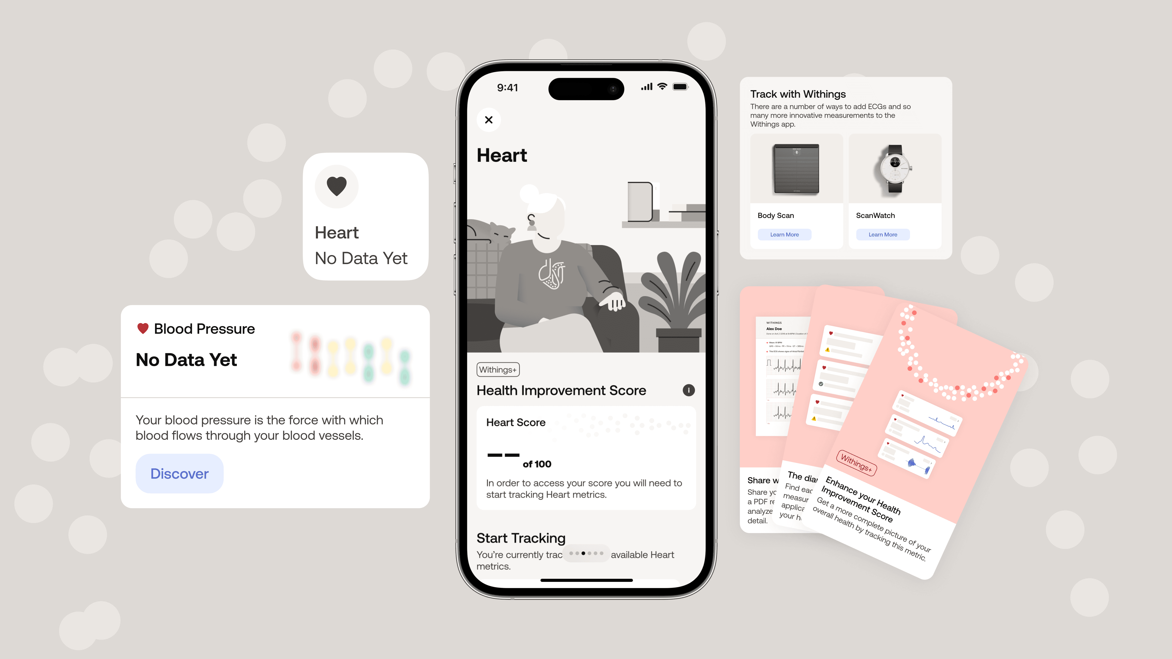
The Measure Tab in the Withings app now includes new start tracking features that promote other Withings devices and educate users about the ecosystem. Previously, there was no cross-selling in the app, resulting in missed health opportunities for users and huge business potential for Withings. These new features emphasise where data is missing by using empty states, greyscale categories, grey particles in the Health Improvement Score and blurred dataviz for missing biomarkers.
The Measure Tab in the Withings app now includes new start tracking features that promote other Withings devices and educate users about the ecosystem. Previously, there was no cross-selling in the app, resulting in missed health opportunities for users and huge business potential for Withings. These new features emphasise where data is missing by using empty states, greyscale categories, grey particles in the Health Improvement Score and blurred dataviz for missing biomarkers.


Apple Watch
Apple Watch
Apple Watch
Bonus
Bonus
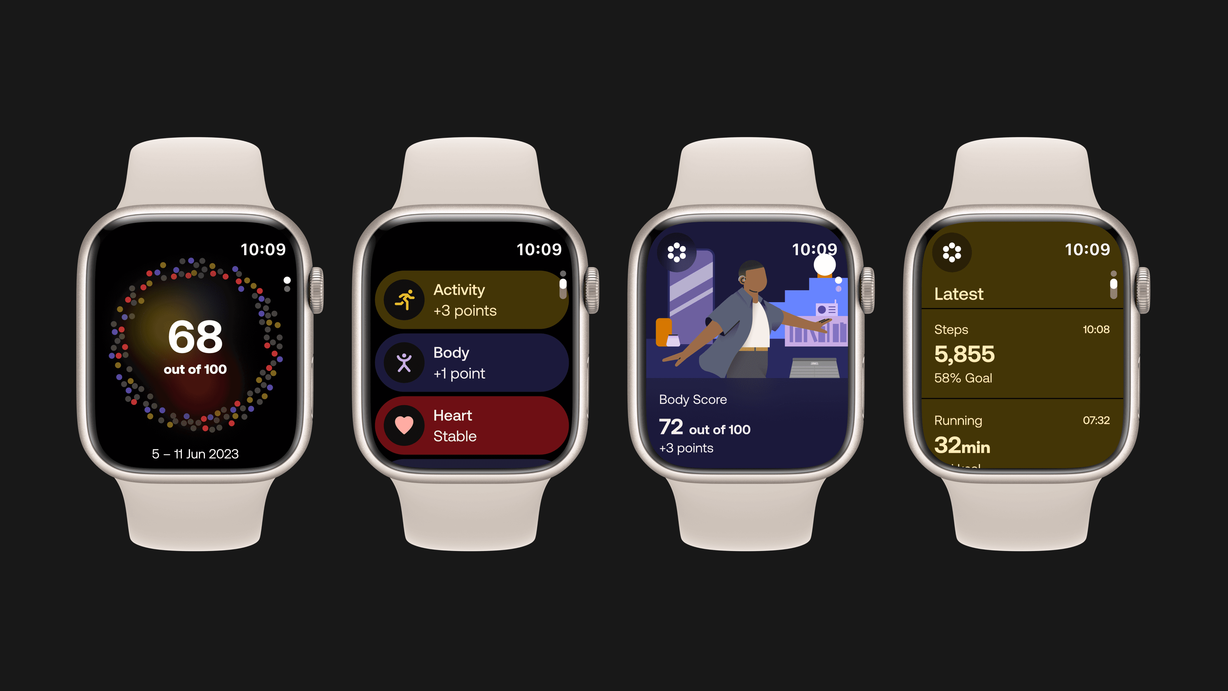
A sneaky side project that makes the Health Improvement Score, Health Categories and latest measurements available directly from user's wrists.
A sneaky side project that makes the Health Improvement Score, Health Categories and latest measurements available directly from user's wrists.



Contact
These short project overviews barely scratch the surface of my process, the immense challenges we encountered, and the rich collaboration that took place, but hopefully it was enough to spark your interest.
Contact
These short project overviews barely scratch the surface of my process, the immense challenges we encountered, and the rich collaboration that took place, but hopefully it was enough to spark your interest.
Contact
These short project overviews barely scratch the surface of my process, the immense challenges we encountered, and the rich collaboration that took place, but hopefully it was enough to spark your interest.
